Saturday, August 27, 2016

Flood Filling Photos


Look closely at this photo of a succulent from my garden.  In the background, I have filled the background with a whimsical succulent shaped flower brush, set to change colors on a gradient that matches those in the succulent itself.  But, sometimes I fill elements of my photo with patterns elements from my Gimp created pattern files.  And I have found it rather interesting to fill more than the background.


The larger more colorful pattern overlaid in the petals of this Angel Wing Begonia, definitely shows that this picture was altered.  A denser, smaller pattern of dots on the same flower is less noticeable.

The one above simply looks more like it's made from fabric. but doesn't show well on the web.


These two butterflies, cause you to take a second look.  Perhaps, not as immediately obvious that patterns have been introduced, simply because they are an item in nature that has a variety of color. 


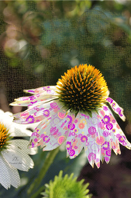
The coneflowers that I worked on today, show a development in both my skills at doing this, and in the patterns I've made which fit better the size of the subject.  What I developed and call "light Kisses" blur the upper background even more than the camera had, and the tiniest screen weave fill softens the lower half of the pic.  As a result the Coneflower itself is high-lighted on the page, and the sunshine on it's cone seems to glow.  The pattern is so unobtrusive, that you accept it in the picture immediately. 
 
I have worked for years now creating patterns, repeats and fills, first filling my need for bright colors, and now producing more pastels and shaded colors.  Some of my favorite fills to work with, are squares, densely covered with various shapes and colors.  And the very fine fill that resembles crackles, screen wire, fibers and dots.


The finer fills in the above two pictures are almost entirely unnoticeable, subtle in sharp contrast to the bubble and flower brush accents, added to the pictures, for interest.  I often use a version of bubbles, made by using one of two brushes I made, and setting them in different levels of opaqueness.  I sometimes use the eraser brush and put a layer behind the picture.

When I flood fill, I make sure that I don't try to completely fill an area, but rather allow the pattern to be broken and only indicative of the whole pattern.  As if it was applied, and then partially rubbed away.  Sometimes, I do click several times, in an area, to get the coverage and intensity I want for the fill.  And sometimes, I fill an area with more than one pattern.  Colors should contrast enough to show up, without completely destroying the picture beneath. 

Items with a lot of  fine texture, like rocks for instance, can be difficult to fill.  If I really need an area to fill in spite of the texture for the sake of the art and balance on my picture,  I may use my smudge gadget/brush to smooth the texture in a random manner, so that my fill will apply.  But overdoing this will make the picture look very artificial, so be careful.  and test a small area first.  I also work on copies. 

I really enjoy dressing pictures this way, and have some art that really fools people sometimes.  And I often have people think I have purchased the picture, or picked it up online... I will print some soon, and get some reactions to some of them being framed.  Looking forward to seeing them printed myself.  

I just love Prinkin' stuff.

THINK PRINKED!!

Monday, August 3, 2015

Problems with Gimp

I've been so bummed with the problems I've had with Gimp.  Actually, Gimp opens and tries to run.  Sometimes when I pull all the old versions off and load a new one it works for several projects and then it stops working.  It always says that there's a problem and windows is seeking a resolution.  I hate I can't open all  those saved project files. There are so many things I didn't save as a jpeg or png to save space, and now I am regretting it. I could always have deleted them.  You live an learn...

So with the advent of Windows 10, will I ever be able to use it again.  I have found that the problems also are with the outside computers systems that Gimp works off of. Those companies had begun to load other programs onto people's computers, against the truth of their original agreements...thus the blocked open/runs I have tried to install. 

So the problem has been with the programs not the user, and I feel admonished a bit, because I hear that I am the problem a lot.  I genuinely miss my pattern making abilities.  Don't like the format for Photo-shop and never really have.  Many complain about having multiple tiles open and want all the gimping options on one pane.  I find it a little overwhelming to have to look through all the options rather than getting to pull up the pane with the particular function I want to do and then let it fall into the background when not using it. 

Well, there is not much I can do about it all now, so doing art for Prinked Ink is seldom possible now.  I have enjoyed the break from the computer, for my health's sake and for the joy of developing a garden. And for the joy of not having someone hacking my computer all the time.  But I miss the art of it.  But I just wanted to explain why my blog is not staying up to date.  Yet I like that my comments are here to review, for my own sake, if for no other reason.  The last thing I did with my patterns was to put some of them onto coffee mug size formats, so I can have a few mugs made.

So here are a couple:

 Wraps  for mugs


Awaiting an opportunity - perhaps 10 will solve the problems on my computer's end.  Hopefully, Gimp will solve things on theirs.  And I can be a happy camper once again. 
C

Tuesday, May 27, 2014

Pages of Repeats/Backgrounds

Last post, I showed patterns I made from color and pattern filling some brushes, or by making repeats of brushes. Now I can use them in turn as brushes or patterns for flood fill, and make pages of patterns, like fabric or backgrounds.
    
                                             THIS:

TO THIS

THIS:

TO THIS:
 
THIS:
 
AND THIS:
 
 
From simple repeats of brushes.


The pattern above becomes a card background, while the diamond brush repeat
becomes the flood fill pattern for the open heart brush.


I used the same diamond repeat to flood fill the right lower half of this square,
and my curled flourish pattern for the upper left corner, and let it bleed over the
ribbon brush dividing the page diagonally.

My new Scalloped Circles Brush makes a great repeat for a border at the top of a page:

but works well on a card with the plaid counterpart both repeated small,
and 1 1/2 times large:
 
I am surprised how simply the fill patterns can be made once the
original pattern is made into a brush. And it's only the beginning of how
they can be used.

I am loving journaling some ideas.  And as I work with the brushes and patterns I am
learning tricks on how to make them seamless, overlapping, or interactive.

Next post: using the patterns to flood fill brushes creating even more layers
and design ideas.

Saturday, May 24, 2014

A Few Brushes

These are a few of the solid brushes I designed.  I design them on transparent squares, and I also crop to image to make sure there is no extra space around them.  Well at least now that I learned the need for that step.  
 
It might be possible to notice that a couple of these are merely made by repeating a more basic brush. In fact, I try to think about that when I make the brush. I wonder how it will repeat, and if a reasonable pattern or border can be produced by repeating it? An easy one to see is the double heart with rings. The "bracelet" band I made with it is in the bottom center of this pic. The s link repeated vertically instead of horizontally made the upright border, but the one on the left has butterflies included in the repeat.  I also have a combination of it using the dragonfly. Here the dragonfly is tapped several times to darken it.  It is actually very sheer unless I tap it in place until it darkens. The bird and the lily are actual pictures converted to brushes. I cropped a mask out and filled the shape solid with black. I have used the same heart over and over by using the perspective and shearing tools, flipping and scaling the altered shape. Why draw it again and again? I often draw 1/2 or 1/4 of the shape or pattern, and then flip merge and flip again to form a whole.
 
But lately, I have used the simple shapes to come up with a page of brushes that make a pleasing pattern, changing up the colors, to make a pleasing color scheme from the block:
Repeating a page of these will form a flood fill pattern, which I save in the patterns folder.
Next blog: some of the pages of repeats I use for pattern fill.
 

It's Been a While...

I have not posted to this blog regularly for quite some time.  One of the things I hate most is how quickly the technology moves on, and if I try to keep up my blogs, I have to spend far too much time doing the technical stuff.  I tried to enter some new work to my website at Wix, and they have changed things, so now for some reason I can no longer add pictures. I had wanted to do a slide show of some of my new patterns and brushes.
 One of the things I have expanded in my Gimp experience is using the brushes to make pages of patterns, which I may in turn make new brushes from. Then using that page pattern, I will do a page of repeats, as many as will fit evenly on a new page, making a repeating pattern to add to my patterns. Then I will flood fill shapes, words, and backgrounds, with the resulting patterns.  I have come to realize how immense the possibilities are to patterning. But also how professional the finished products can be.

The uses are indeed endless, but experimenting with them has brought up some issues as well.  I love making most with transparent backgrounds, but occasionally I have found it is best to reload the individual PNG and give it a background.  Many of my patterns and brushes are very flowery.  But I have found a new love for plaids, angled shapes with repeats, and simple shadings. I have found many of the patterns loaded into Gimp already are too small for most of my work.  But, occasionally they are perfect for flood fills.  Rather than talking about it, I can show some examples.

NEW BRUSHES:


A simple brush, tapped a couple of times, with the settings for the brush change to random color, and size makes and airy simple design. But this simple design becomes an amazing set of overlays, when tapped over and over, stopping only when I like the design.


 Blue and purple are the foreground and back ground colors on the color selector. I selected only the two tone gradient setting here, or used the random selection in the brush menu.

Below, I merely changed the colors, and possibly selected a narrow range gradient.

 
Below: I Used a combination of open and solid hearts with random size selection:
The shape is an open heart brush I designed. Then I flood filled it with the pattern which I also designed.

The two above and below, were repeated taps with settings on a gradient with numerous colors and random size settings.

The Open heart brush was used below, but I changed its color in the options menu, selecting the color I wanted it to print.  The flood fill was a repeating diamond pattern I designed. It's possible to see the square repeats of the pattern by the fine white lines.  this occurs anytime the open area being filled exceeds the size of the single square.
These last two are repeats like above but of only two colors. The pink and the background black.  The size was set to random. On the first, I filled the center heart with a dot pattern I designed, but then I went back and put a few color changes on the dots. This can be done 2 ways. Either, I tap on a similar size dot over the picture, changing the color of each. Or more simply, I can flood fill each dot, choosing colors.
I then initially filled the other 3 spaces  between the hearts with a lime green. I often do this on a separate layer so I can change the fill color at will. Then I filled once again with the curly floral pattern, which already contains shades of pink.

On this one, I filled the outside brush with lime color and overlaid a flood fill of pattern. I left the second heart pink, and flood filled the center with the dot pattern which I colorized as above.  Only 2 clicks of the brush, here. I could have left it black, clicked twice. I would have two black hearts of two separate sizes. I would have colored both. and possibly filled the center with black to prevent bleed.. Then I could do the flood fill. on the outside heart and inner solid heart.  This same thing could be achieved by filling 3 sizes of solid hearts on 3 layers.  That is handy sometimes for separating the work and moving it around.  But for something quick and easy.  2 clicks of a brush and quick fills and done.
 
Next blog:
More about brushes, patterns and fills. It gets more and more fascinating when I discuss how I made the fill patterns.
 

Friday, December 28, 2012

My New Website

Lately, I have been designing a website with a portfolio of my work.  I have used the elements and pictures in the portfolio to design graphics for print.  The artistic concepts of graphics change from year to year in much the same way clothing, and furnishings do.  So to keep up with the technology, much less the art is a real challenge.  I have no illusions of ever becoming as accomplished as some, but I certainly enjoy learning something new as often as I can.   I am introducing my website and making the connection to it today.  Some of the pages require that you become a member of the site in order to view them.  It is a slight inhibiter to having my work stolen at a pace faster than I can produce it.  But, eventually, I want my work to be usuable.  I would like to see my efforts bless someone else.  With the onset of digital photography, pictures became a passion for me. The greatest benefit of being able to take so many pictures is that you can take so many pictures.  I therefore am less attatched to them.  Making some available for others to see, is genuinely fun.  Check out my website here:
 http://tenacbirder.wix.com/prinked-ink#

and in the future from the side bar. Hope you have an opportunity to prink some ink one day soon!

Friday, August 17, 2012

Inspired by the Natural ~ fullfilled by the Technical

Textural and natural things inspire me.  I simply love taking pictures of my wood pile, for instance.  We were unable to use the wood last winter because it was so warm. As a result the bark is coming away from the logs. The cuts are ragged and curling. In Gimp, I did various filters on the pic, with the last one being a "Gimpressionist filter." I found one that looked like threads. What an interesting look! Can't wait to see what this filtering does on pine cones and mushrooms!

Wednesday, July 11, 2012

All this week I have been thinking about how much detail is involved in the way the Lord dressed our earth and everything in it and beyond it.  When I found the word "Prink" in the dictionary one day, and read that it meant "to dress for show, preen," I couldn't help but think of that being what a designer does, then prints it, and tries to bring it to a place of usefulness or share it in a place which displays its beauty.  God is the author of that.  And I love being a part of his creative spirit. But in this great scheme of things, there comes a time when things need to be revived. That is as much a part of the natural way God created things as new design is.  Revival, Renewal, Re-enlightenment, and Restoration are a part of the cycle of life. It is time that our nation seeks it, that our families seek it, and our churches seek it. The commitments of our forefathers and the dreams of our youth need to be revisited, and the truths of prosperity need to be revitalized. All of the things that make our lives continue on means that we must revisit them and somehow address their needs to be dressed up when they begin to look shabby.  Why do we always get so gloomy when we see the need?  We don't mind buying new clothes, or new food, or going on new vacations. Our world needs some Prinking. Like a bird preening feathers after the rains, we need a resituation everyday of our lives in some way. Let's get "prinking!"
My prayer is that the Lord will abundantly provide. AMEN

Read more:
http://agardencalledgethsemane.blogspot.com/

http://www.mywingsaremadeoffaith.typepad.com/

Saturday, July 7, 2012


In my newest learning endeavors, I have been playing with creating brushes and patterns for Gimp projects.  Funny how some things have become so second hand easy, and others still don't click.  Not that it's hard, but that I can't keep the correct sequence in my mind to get the desired results.  But practice makes perfect.  I decided to make a file into which i just put the stuff I was playing with, and I went ahead and made a brush or pattern file that I can take to the gimp files when I need them, instead of just filling up the dialoge boxes with something I might not use often.  This way I can copy them over long enough to use them and delete them when I am not.  I get tired of the same old swirls and curves so I ususallly make fresh ones these days anyway.  But the grungies and scratches, smears and blobs take time to get good results, so it's best to have a variety of them made which are large enough to move them about and use only parts of them.  I discovered that I can use only parts of curls and swirls too to cast shadows and erase out swaths of color.

 
This is a disconnected set of curls,
connect them and they become lace.


I love ceating my own Capital cursive letters.
Roughing them up a bit using several filters and
brushes enhances them.


I designed various settings and styles of this potential brush. 
Filling it with a marble pattern already available in my gimp
patterns gives me a cool look without having to create the pattern.

Friday, June 15, 2012

Gimp Brushes


I have discovered making brushes in Gimp..WOW what a great world of reward for your work it opens up.  Just wondering the best way to reserve the brushes without putting them all in the dialogue box.  Thinking I will save them in a separate file, and move them into and out of the actual gimp file and dialogue as I use them. Still simpler than making from scratch every time, and hunting them in various files.  More on this as I make them.  So many ideas!

Monday, April 2, 2012

Photo Art

In the sixties, I had an English teacher who was only a few years older than we, and she was so much fun. One day she brought in photographer friends of hers to show us a slide show of their work. I will never forget how impressive their black-n-whites of graphic looking things were.  Full of angles and shadows, stripes and boxes, corner to corner off kilter subjects and people hanging upside down.  They made an impression on me and were the first real longing I had to someday get a camera and use it to create art.  This week I had a few opportunities to capture some shots that captured that aesthetic.  If you look around, good black n whites are everywhere.  But the best ones are not where you set the camera to black n white but where the light and darks create a grey tone image with touches of color.  Sometimes a rainy day and some silouetting adds to the effect.  Rocks in water under gray skies for example. 
Another way to make things happen is to dress subjects in black n white or grays, and make sure the background is also a grey, white, or black, and let the only thing in the picture be skin tones and 1 tiny object with a defined color.  Rather than going back to computer colorize the object, make it real. To go one step further, the subject could wear gloves, and colored hose, ( stiped ones are fun,) and a white outfit and hat. Turn the subject away from the camera, and avoid getting any skin in the pic. Really fun artistic prints can be acheived.
One of my favorites is my brother's arched bridge over the ditch near the road at his house. In the early morning sun, it was all grays and whites. Open your eyes to the things around you, and create a black-n-white pic that is taken in full color!  

Friday, March 30, 2012

A wedding bouquet of ivory roses, stephonotis, freesia, and pearl pins
is altered in gimp, to produce a guiled look. 
Romantic and luscious,  uhmmm.

Wednesday, November 30, 2011

This line drawing of packages is actually a font blown up and colorized.  I created the brush in the brush edits box to make the flower like stars. This would make a great little gift card. I even like it in black.
So glad it's Christmas. I hope I can celebrate every day with a little Prinked Ink.
LOL

Tuesday, November 8, 2011

Prinked to Look Like It's Sewn


From this
to
This:


Thinking about unconditional love this last few days has inspired me to seer it into my brain every way I can. By adding the cloth filtering, blinds filters, and using a three pointed brush that I can rotate to look like blanket stitching, I was able to make the paper effect look like it's sewn fabrics - corduroy on crepe, with the love resembling crisp organza printed with the sixties look felting print. Like dotted swiss only shapes. The girls in my wedding wore an overlay fabric with daisies on it like that. Don't you just love the button and button hole? I really loved the final touch of inserting an antiquing layer over the corduroy.  I can't get over how much this brush resembles stitching.  I just love playing with this stuff! All that love reminds me ~
 I totally LOVE that
JESUS LOVES ME UNCONDITIONALLY


Friday, October 28, 2011

October Was a Busy Month

Apart from getting a nasty put you down cold, it was the anniversary of my Mom's death, my grandson became one year old, and my brother-in-law passed into the arms of Jesus.  I also have two precious neighbors who are dealing with the hardships of life, and threatening medical issues of precious family members.  On top of that I cannot download pictures from my new computer for some reason.  So, all of October was a bust for doing art.  But I did download Gimp for my grandson to use doing a project, and he picked up on what it has taken me 6 months to learn in 30 minutes.  He said his project looked professional, except for the fact that the wizard we used cut about 1/2 inch off of everyone's printed project when it printed and no one could fix it.  At least the hours we spent trying, was something no one else could fix either.  Not good that it takes a computer IT guy to do home work.  But doing work with my grand son inspired me to get back behind the art.  Have been testing over one hundred names for a new blog that will feature some wonderful artists. Only 6 were not already in use, and all but two of those seemed like something that didn't represent us all.  But I thought of a new one tonight so we will see where it goes.  It's Punkin Time!!! I have a gourd to paint. So maybe I will get a picture of that up.  Til next time... C

Monday, August 22, 2011

Coming Soon

In the next few weeks I hope to get a new blog hub up and am going to introduce you to my artistic friends and family. Each artist has his or her own perspective on art and there will be a variety of media to explore. I am so excited to get these people linked and to share their talents with everyone. In days gone by, American Business was built on people supporting one another by word of mouth advertising, and by buying their products. Communities survive by making commerce personal and productive to that community. But also by bringing in new ideas and sharing common interests.  The world has gotten so big that America is now our common community. And is need of good old fashioned "Capitalism."  But how do you know who to support? Word of mouth. I want to personally commend these people for the beautiful work they do, but also for the wonderful spirit they have, and the greatness of their Character. So proud to be able to present them to you. Can't wait to  get the blog up and going. Initially, purchases of their work will be by personal contact, but in future months, those who wish may direct you to their web pages or online stores. Stay in touch.

Monday, August 8, 2011

Away too long

July has been such a busy month that I haven't even added a single blog.  Still have up the July calendar and haven't put up the August one.  Oh well, I guess it is a good problem to have if you are getting things done.  The old computer has been about to crash I had so many pictures and graphics piling up.  So had to get some of it stored.  Ready to start filling the void. LOL But not tonight. New calendar soon and maybe a pic or two.   But I have definitely been away too long.

Tuesday, June 28, 2011

Inspiration and Preservation

From the "Monthly Mini Series"
by Cynthia Wilkerson
My inspiration for the Monthly Mini - Florals Calender for July this year was one of my favorite sets of pictures. My mom's garden included the beautiful blues of ZigZaz Spiderwort, which need something to attach themselves to in order to keep jointing upward.  Blooms are produced at each joint, where only two or three florets are open at one time. 
An abundance of other little blooms await their time to open, but hang down on short stems, giving them the appearance of a spider with legs.  The plant stems had attatched themselves to the rusty old fence, my dad errected to keep me from fleeing into the street where my mother couldn't get to me so many years ago when I was a toddler. When I took the pictures, I knew mother was ill, and her time on earth was waning, but I didn't expect to know when the fence was gone. It happened just before Mother passed, and I am so glad she didn't see it.  So the beautiful blooms on the rusty old fence hold a very special place in my heart now.  In their place the city has put a very city like piece of concrete, a sidewalk and a very shiny silver chainlink fence.  Somehow, if any of the spiderwort remains, I don't think it looks as good as it did on the rusty old wire...   :(
C