

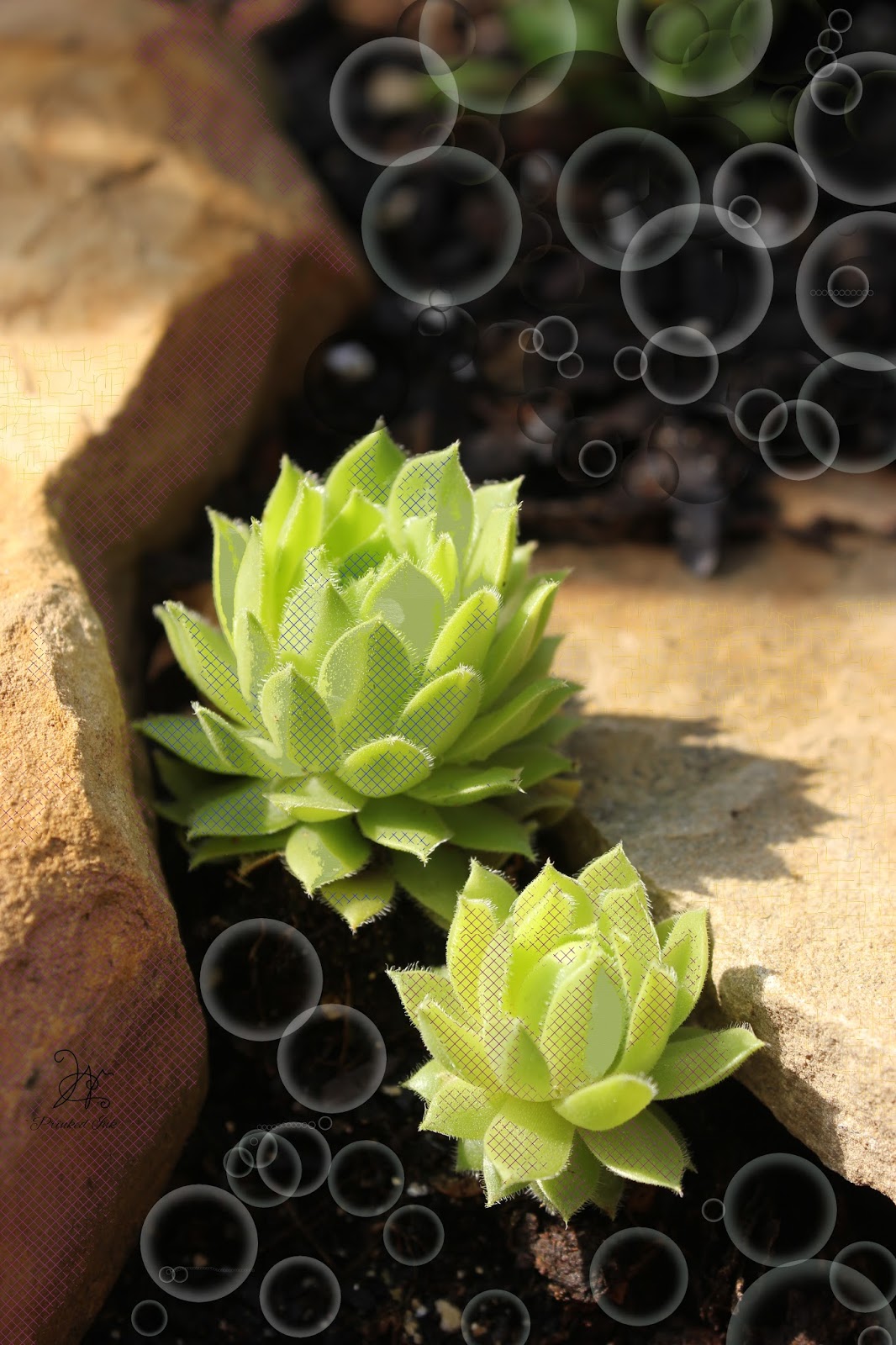
Look closely at this photo of a succulent from my garden. In the background, I have filled the background with a whimsical succulent shaped flower brush, set to change colors on a gradient that matches those in the succulent itself. But, sometimes I fill elements of my photo with patterns elements from my Gimp created pattern files. And I have found it rather interesting to fill more than the background.
The one above simply looks more like it's made from fabric. but doesn't show well on the web.


These two butterflies, cause you to take a second look. Perhaps, not as immediately obvious that patterns have been introduced, simply because they are an item in nature that has a variety of color.


The coneflowers that I worked on today, show a development in both my skills at doing this, and in the patterns I've made which fit better the size of the subject. What I developed and call "light Kisses" blur the upper background even more than the camera had, and the tiniest screen weave fill softens the lower half of the pic. As a result the Coneflower itself is high-lighted on the page, and the sunshine on it's cone seems to glow. The pattern is so unobtrusive, that you accept it in the picture immediately.
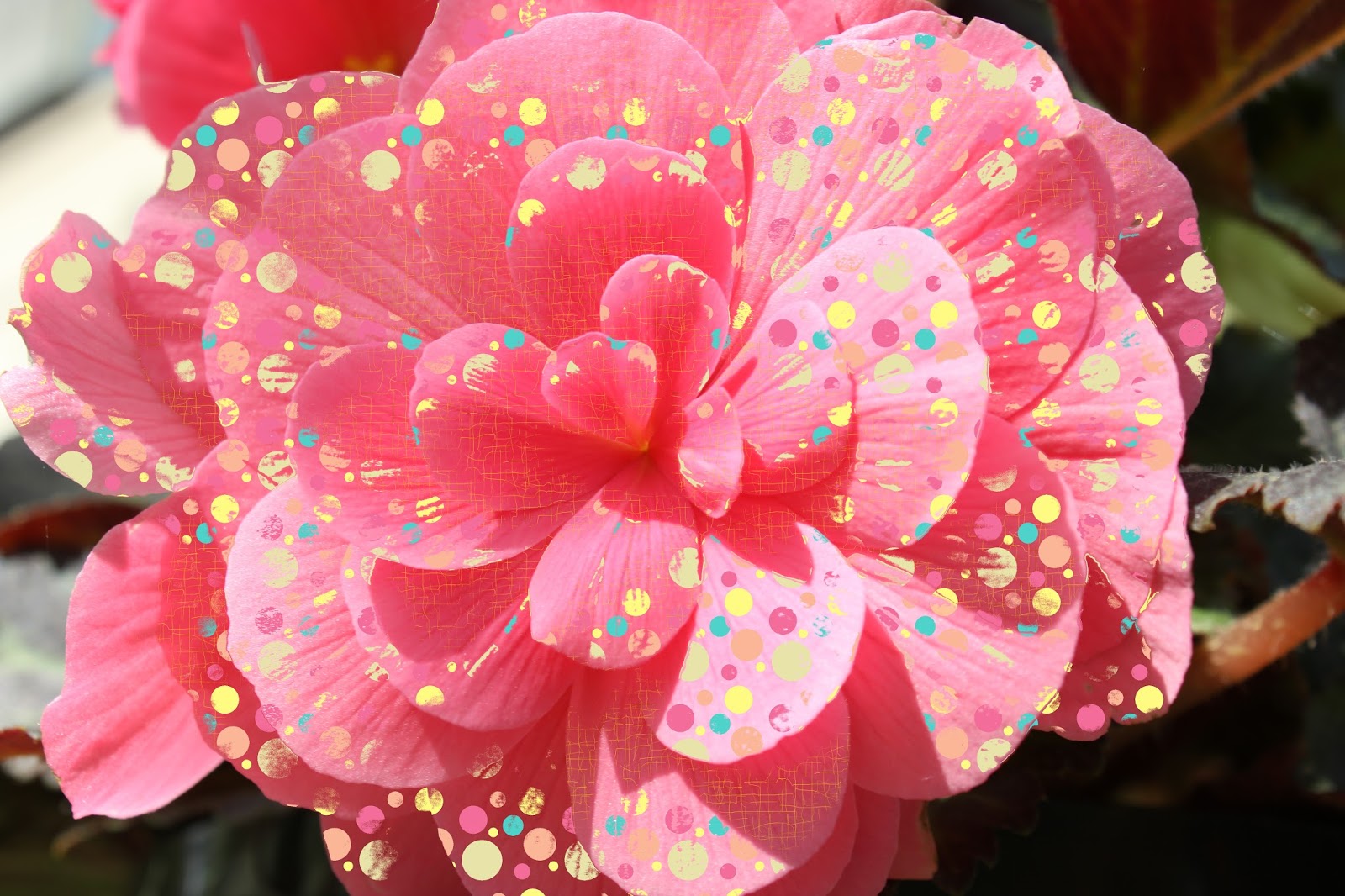
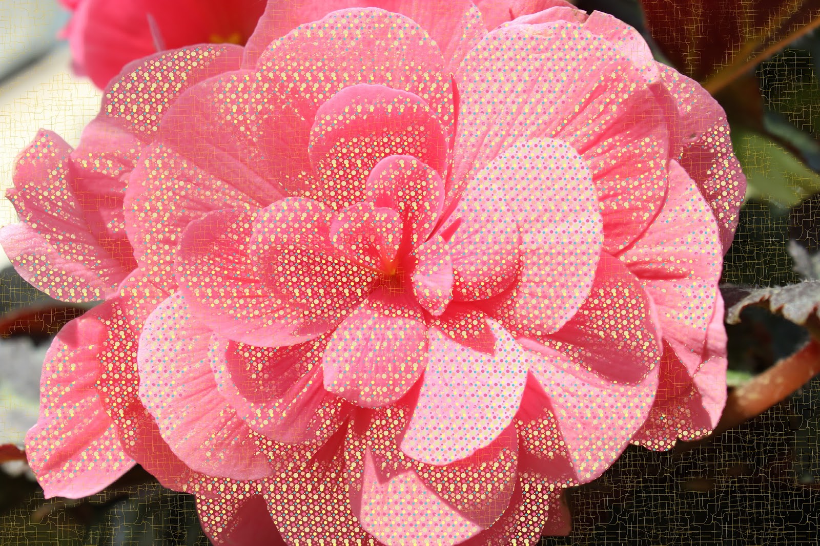
I have worked for years now creating patterns, repeats and fills, first filling my need for bright colors, and now producing more pastels and shaded colors. Some of my favorite fills to work with, are squares, densely covered with various shapes and colors. And the very fine fill that resembles crackles, screen wire, fibers and dots.

When I flood fill, I make sure that I don't try to completely fill an area, but rather allow the pattern to be broken and only indicative of the whole pattern. As if it was applied, and then partially rubbed away. Sometimes, I do click several times, in an area, to get the coverage and intensity I want for the fill. And sometimes, I fill an area with more than one pattern. Colors should contrast enough to show up, without completely destroying the picture beneath.
Items with a lot of fine texture, like rocks for instance, can be difficult to fill. If I really need an area to fill in spite of the texture for the sake of the art and balance on my picture, I may use my smudge gadget/brush to smooth the texture in a random manner, so that my fill will apply. But overdoing this will make the picture look very artificial, so be careful. and test a small area first. I also work on copies.
I really enjoy dressing pictures this way, and have some art that really fools people sometimes. And I often have people think I have purchased the picture, or picked it up online... I will print some soon, and get some reactions to some of them being framed. Looking forward to seeing them printed myself.
I just love Prinkin' stuff.
THINK PRINKED!!
No comments:
Post a Comment